Wednesday 25 February 2015
Illustrator Portrait
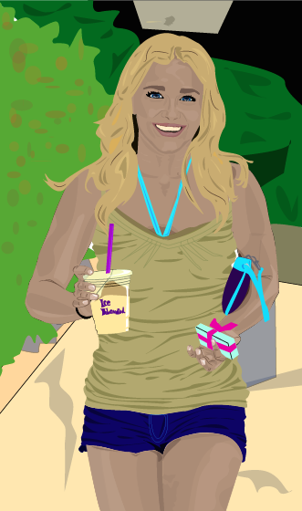
This process took a long time.
I used lots of layers in order to build up the colors and emphasize the highlights and shadows, not just on the body, but throughout the whole image.
Due to the amount of time it took to complete this project, I spent a lot of time on the clothing, accessories, and face. This meant I ran out of time to complete all the other aspect of the image to the same level. The hair and the background I rushed through and although I am pleased with the overall outcome of the piece, I would have liked to have made this more detailed and in general, just a little better as I feel I could have.

Tuesday 17 February 2015
Vector Illustration
For my next project I created a vector illustration using only Adobe Illustrator. This began as a more collaborative project, as we folded a sheet of paper in three then blindly and randomly drew the three sections in segments without knowing what the rest of the body looked like. I chose the following image to recreate in Illustrator:
 I added color and used artistic license to make it more personal and what I believe to be aesthetically pleasing. I then came up with a concept for the background design. Due the the Florida State Fair being in town, I decided to use this as inspiration. I wanted to create a unusual, foreign feel to this image causing it to feel a little barren. I used a bright color scheme to contrast with the deserty ground. I believe this fits well with the design of the monster.


Monday 9 February 2015
Final Logo Design
The logo I decided upon was the first design out of the hand-drawn listings shown in a previous post. In a survey, this proved to be the most popular design and represents the exotic, hawai'iany vibe I was shooting for. I began by drawing the outline with the pen tool.
 I then added color using the pen tool. I didn't want to the logo to appear flat, so I used a range of colors and opacities to build up layers, textures, and depths within the different hues. I wanted to keep the bright, airy feel so stayed with a more pastel color scheme. To allow the word "Smoothies" to be seen clearly, I kept the center of the leaf a light green, making it darker and layering it up closer to the edge.
With the flowers, I wanted bright colors that would stand out and be clearly seen and recognized from a distance. I, therefore, created texture and a range of merging colors by using short strokes, from light in the center, to dark on the outer edges of the petals. To cause them to appear more involved within the logo and not just backing decoration, I placed the "A" and "L" infront of the hibiscus flower with the center parts of the flower overlapping the "A", so the word was still clear, but the second "O" I placed behind the petal. I feel this causes the appearance of all aspects of the logo being intertwined and appearing as one.
The blue of the writing I had originally planned to be white. I was not, however, thinking of a background and, therefore, it would not show up or be clear, possibly looking unfinished. I chose a blue color to make the word "Aloha" stand out. I didn't want this word to appear segregated to the rest of the design, so I tried to merge from dark blue to light blue throughout the word, then into green to the leaf.
The black outline kept the shapes looking separate and clear. This outline was not needed on the bottom of the leaf as there are no other shapes or colors in it's proximity. I, therefore, removed the black outline to create a less harsh look, whilst- I believe- still keeping the finished appearance of the overall logo. The typography within both "Aloha" and "Smoothies" was custom made. The "Aloha" I drew with the pen tool, masking and adjusting a hand drawn type, creating all the letters to be mechanical shapes, except for the last "A", which I tried to create using more fluid lines to appear organic and merge into the leaf more easily. This is apposed to the "Smoothies" for which I used a pre-made font, then created an outline and adjusted the anchor points, angles and curves.
I then added color using the pen tool. I didn't want to the logo to appear flat, so I used a range of colors and opacities to build up layers, textures, and depths within the different hues. I wanted to keep the bright, airy feel so stayed with a more pastel color scheme. To allow the word "Smoothies" to be seen clearly, I kept the center of the leaf a light green, making it darker and layering it up closer to the edge.
With the flowers, I wanted bright colors that would stand out and be clearly seen and recognized from a distance. I, therefore, created texture and a range of merging colors by using short strokes, from light in the center, to dark on the outer edges of the petals. To cause them to appear more involved within the logo and not just backing decoration, I placed the "A" and "L" infront of the hibiscus flower with the center parts of the flower overlapping the "A", so the word was still clear, but the second "O" I placed behind the petal. I feel this causes the appearance of all aspects of the logo being intertwined and appearing as one.
The blue of the writing I had originally planned to be white. I was not, however, thinking of a background and, therefore, it would not show up or be clear, possibly looking unfinished. I chose a blue color to make the word "Aloha" stand out. I didn't want this word to appear segregated to the rest of the design, so I tried to merge from dark blue to light blue throughout the word, then into green to the leaf.
The black outline kept the shapes looking separate and clear. This outline was not needed on the bottom of the leaf as there are no other shapes or colors in it's proximity. I, therefore, removed the black outline to create a less harsh look, whilst- I believe- still keeping the finished appearance of the overall logo. The typography within both "Aloha" and "Smoothies" was custom made. The "Aloha" I drew with the pen tool, masking and adjusting a hand drawn type, creating all the letters to be mechanical shapes, except for the last "A", which I tried to create using more fluid lines to appear organic and merge into the leaf more easily. This is apposed to the "Smoothies" for which I used a pre-made font, then created an outline and adjusted the anchor points, angles and curves.


Thursday 5 February 2015
Caligramme
Aside from the logo design project currently dominating my blog, I also looked into caligrammes.
Using only Adobe Illustrator, I completed a caligramme of the globe. Travel is something I am very passionate about and plan on continuing to do it throughout my life.
To begin this caligramme, I drew out a circular shape with the pen tool, then put text following the shape, leaving the fill blank and the outline/stroke black. On the outline of the planet, I chose to write a poem that I find to be intriguing and just like in general, relating to the topic. It reads: "San Fransisco has a park. Albuquerque is beautiful from a distance; it is purple at five in the evening. New York is Egyptian, especially from the little rise on the hill." I then added text (listed countries/locations eg.."Bali~ Cornwall~ Japan~" etc... vertically inside the planet to create the outline of land. Inside the countries/continents, I fitted a custom type, filling the area. I used a variety of greens for this typography to create the illusion of land. Since I was creating a whole planet with words, I decided to write "Words Shape The World" and "Travel". I feel this is kind of a play on words and might cause people to think or consider the different meanings of that. To create the illusion or imagery of water in the ocean, I drew wave shaped lines of different lengths, then, using different typography, sizes, and color for each line, I wrote words that connote the ocean such as "Wave," "Surf," "Depth," etc.... I left the continents that appear white blank (on the Pole), as I figured any writing would taint the simpleness of it, possibly causing it to appear cluttered.
 I have also used Adobe Photoshop to create calligram of a different style. Although not assigned in this class currently, I thought I'd include it anyway as did many projects like this last year whilst earning my Art and Design Diploma.

To begin this caligramme, I drew out a circular shape with the pen tool, then put text following the shape, leaving the fill blank and the outline/stroke black. On the outline of the planet, I chose to write a poem that I find to be intriguing and just like in general, relating to the topic. It reads: "San Fransisco has a park. Albuquerque is beautiful from a distance; it is purple at five in the evening. New York is Egyptian, especially from the little rise on the hill." I then added text (listed countries/locations eg.."Bali~ Cornwall~ Japan~" etc... vertically inside the planet to create the outline of land. Inside the countries/continents, I fitted a custom type, filling the area. I used a variety of greens for this typography to create the illusion of land. Since I was creating a whole planet with words, I decided to write "Words Shape The World" and "Travel". I feel this is kind of a play on words and might cause people to think or consider the different meanings of that. To create the illusion or imagery of water in the ocean, I drew wave shaped lines of different lengths, then, using different typography, sizes, and color for each line, I wrote words that connote the ocean such as "Wave," "Surf," "Depth," etc.... I left the continents that appear white blank (on the Pole), as I figured any writing would taint the simpleness of it, possibly causing it to appear cluttered.


Wednesday 4 February 2015
Initial Logo Ideas
After spending some time deliberating between the my two favorite company ideas- the skate shop and the smoothie shop- I decided to further develop the idea of the smoothie shop. I feel this company idea has unique and individual aspect that will make it fun to experiment and play with further.
The next step was to come up with potential logo ideas for this company. The following are seven of my initial ideas, allowing me to pick a route I want to go down and further develop, fine tuning the design.
I have yet to consider or add color or fine tune any of the designs- just getting my ideas down onto paper.
1) On this page, I also messed around with company names. I wanted something unique and Hawaiian related, therefore, listed a variety of Hawaiian words that were a possibility. None of them were easy to pronounce or as recognizable as the simple "Aloha", so that is the name I decided upon.
The first logo idea of mine was influenced by the tropical, Hawaiian, exotic theme of the smoothie bar. Inspired by a location I love, I chose Hawaii's state flower: the Hibiscus flower. I used this to decorate the custom typography. Because this adds a lot of detail around and behind the name of the company, I attempted to make the font clear, large, and fairly simple so it is not suffocated and overtaken by the decoration. The "Aloha" is what I wanted to stand out the most in this design as it is what makes the companies name original, hence the word "smoothies" being smaller, thiner, and slightly less visible. Even though it the "smoothies" is a little less visible than "Aloha", I feel it still works and stands out, as the shading in the leave adds emphasis, balancing out the detail of the flowers and drawing the eye in.
 2) The second design lead me to play with two variations. I wanted to include the actual image of a smoothie, overflowing with fruit to convey the connotations of fresh and juicy smoothies. This furthers what the company would be selling, which I believe is an aspect that helps make a logo strong. I believe it would also allow me to develop a strong, bright color scheme. Out of the two, I prefer the top one. They are both incredibly rough sketches, but I feel it is clearer than the bottom one. The reason behind the design for the second one, however, was I like the idea of intertwining pictures with typography. This is a little difficult though however, as sometimes it can make to typography unclear.
 3) The third logo I have chosen connotes more so the vibes of the lifestyle many of the customers would foster. Once this company gathers recognition and popularity, I would like to expand it to become a chain, but without compromising quality. I would locate these smoothie bars along the beaches of Hawaii and California, appealing to the surf crowd and beach-goers. Due to this reason, I have designed this logo to draw in customers and appear relatable to the target audience. I used a slightly pictogram style of drawing, using three C-shaped curves to create a wave image. With the back end overlapping this wave, I then drew a surfboard, acting as an underline for the company's name. I believe this is an important aspect as it pulls the writing in, creating a more compact logo. The typography within this design is much like my first logo. The "Aloha" is large and bold to appear clear. The "smoothies" is thinner and more italicized, appearing sleek and full of speed.
 4) My fourth logo design has connotations of the exotic theme I want my smoothie bar to convey. I chose to use a humming bird with a large drop from it's beak, in which the company name will wrap around. I liked the idea of using this bird, as it is beautiful and fast. It also is dependent on nectar, creating thoughts of juicy, fresh and nature. To create it to be different, recognizable, and easile replicable, I used fluid, flowing shapes to create the shape of the bird. I believe this style of design also creates it to be unique and has great potential for a bright color scheme.
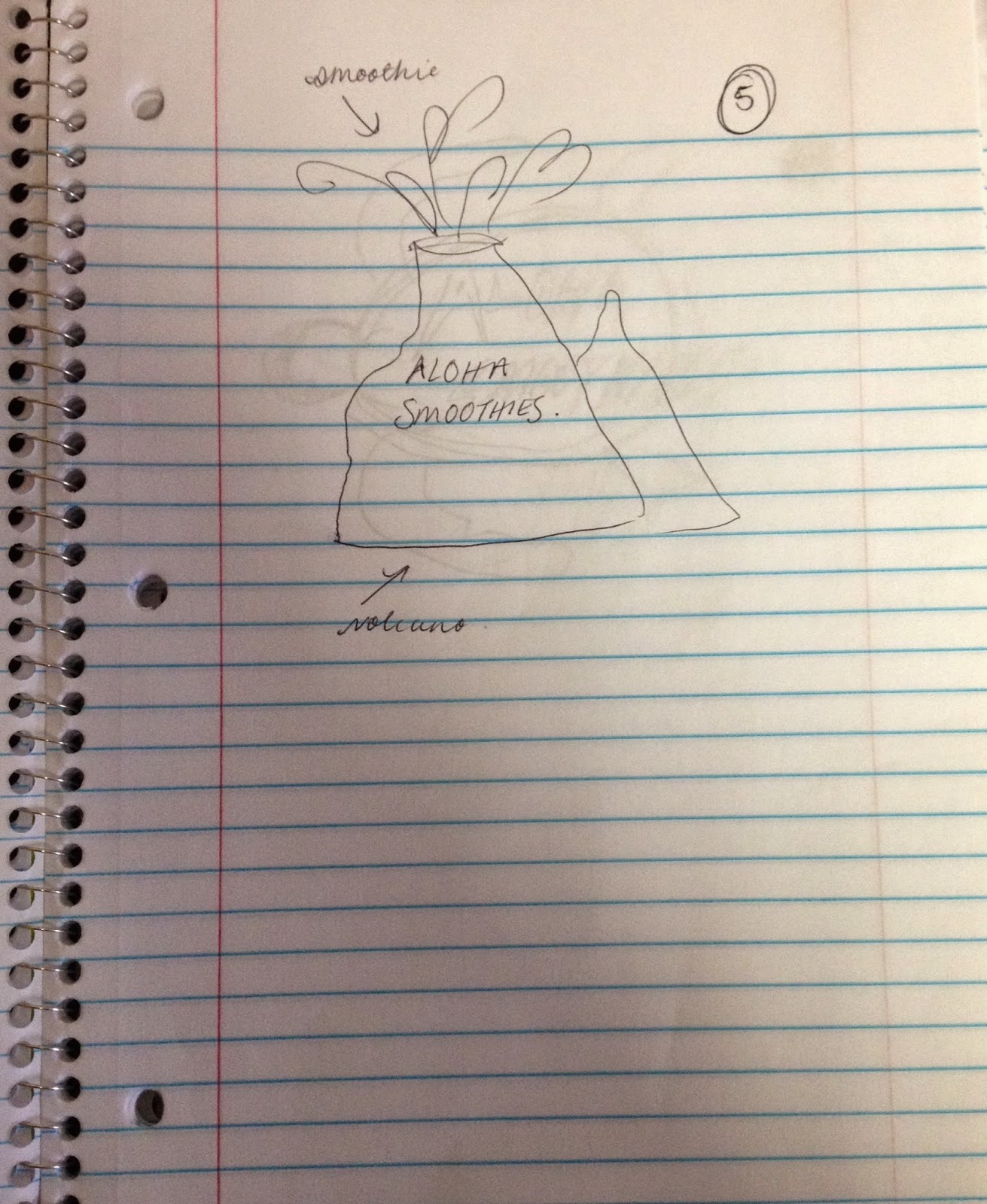
 5) This logo idea was also inspired by aspects of the state of Hawaii. I used the idea of volcanoes. Despite the terrible sketch of the initial design, the idea behind this logo is the volcano- symbolizing Hawaii- is spewing smoothie. It would be active, forceful logo and demand attention due to the nature of volcanoes. I think the idea is good in theory, but I don't think it would make for a very interesting logo so will probably not go down this route.
 6) I like this design mostly due to it's simplicity. It connotes the beachy, surfing vibes through the use of a rugged tortoise, however, it is not heavily related to smoothies so I'm not sure if it would be the most effective logo. I think the typography matches it well, despite the rough sketch, I personally feel it follows the rustic, laid back style. This is exemplified by running it off the background design so that it is not contained, also causing it to pull focus. I would probably use a range of blues for the design, and white for the typography.
 7) The last logo design I created is the 'hang loose' design. This follows the beach, surf-skate, laid back culture prominent in the locations I wish to open my smoothie bars. This is another occasion in which I think incorporating the typography in the design, morphing it together in a way, allows it to be unique and eye-catching.


Subscribe to:
Posts (Atom)