Wednesday, 22 April 2015
Thursday, 2 April 2015
Lyrical Collage
To begin this collage, I researched into various different quotes from a variety of songs, poems, and movies. One of my favorite movies growing up has always been Peter Pan. From both the book- written by J.M. Barrie- and the disney movie both have quotes that stick in my mind. One in particular, and that I chose to make the focal point of my lyrical collage goes as follows: 'You know that place between sleep and awake, the place where you can still remember dreaming? That's where I will always love you. That's where I'll be waiting."
To begin this project, I chose a galaxy/sky image, but it wasn't quite how I wanted it so I flipped it upside down and cropped the watermark out.

I wanted to make it appear as though they were flying across the sky, above the clouds. I, therefore, used a city image, layered it under the clouds and lowered the opacity of the sky. The city lights twinkled through the clouds. I then deleted parts of the sky and left some of the clouds blocking out the city below.


To begin this project, I chose a galaxy/sky image, but it wasn't quite how I wanted it so I flipped it upside down and cropped the watermark out.
I wanted to make it appear as though they were flying across the sky, above the clouds. I, therefore, used a city image, layered it under the clouds and lowered the opacity of the sky. The city lights twinkled through the clouds. I then deleted parts of the sky and left some of the clouds blocking out the city below.
Next, I wanted to create the divide between Neverland and real life. I collected an image of the moon, but it was to reflect on water. This was meant to be the water that is prominent in the story of Peter Pan, e.g. the still river they glide over whilst flying, the ocean surrounding the islands of Neverland on which the pirate ship floats, and the mermaid lagoon.
This wasn't the texture I wanted the moon to have, so I layered another one underneath it. I messed around with various tools, such as the opacity and eraser tool to get seamless layering.
I then added Peter Pan and co. flying. I used an image of there silhouettes on a white background. I used the quick selection tool to separate the shadows from the background and moved them slightly to the left. I changed the opacity, and then the opacity of the eraser and surrounded the whole in the background, creating a shadow effect on the clouds below, shadowing them flying.
Next was Tinker bell, for which I repeated this process. I positioned her to be sprinkling fairy dust on the word "dreaming" as I felt it was fitting.
I then typed pup various different sections to create the quote, editing each text box to entertain it in the picture, e.g. curving around the moon and shadows. On each of these, I edited the colors and opacity of the writing. My aim was to make it appear subtly, so you have to look for it to see it.
In the word love I used to images, brought them away from their backgrounds, skewed them and layered them, once again, editing the opacity. I then merged the layers and included them in the word "love."
My finished lyrical collage (not really lyrical, but a quote) turned out like this:
Wednesday, 1 April 2015
Custom Graphic
I created an image on a letter-sized, portrait sheet using Adobe Photoshop. To do so, I limit myself to only using custom graphics - brushes, patterns, gradients, blending modes, etc.
I used the gradient fill to bring out both the sky and grass, as to ensure the end design wasn't flat.
I created two brush designs to fill in the stars, using the pen tool and added stars to the sky in a variety of different sized brush strokes. I then used a pre-created brush stroke to add grey detail and a little depth into the moon.
On the grass, I also used a pre-created brush stroke to add detail. I used a variety of different greens to add further texture whilst using this brush.
As far as the patterns went, I created a rug. To do this, I took an image from the internet, and attempted to get rid of any seams using tools such as offset and clone. I then went on the background image and used the lasso tool to draw a shape before using the mask layers to reveal the pattern behind it. I experimented chaining/unchaining the pattern/texture and skewing it to help create a sort of perspective. After adding the silhouette of a lady stargazing, I placed the same pattern over the top of the whole image, lowered the opacity, and used the filters to create an overall more vibrant tone.
I ensured that the final result makes some use of the elements of 2D Design (weight, balance, color harmony, etc.) and that the entire canvas is filled.
The pattern was made from the following image:

The overall finished image came out as the following:

Monday, 30 March 2015
Magazine Cover
With this project, I designed a magazine cover following the requirements; using only primary photographic images of myself, and composing it on Adobe Photoshop. I used various methods and techniques to intertwine the various different aspects of this cover, such as text and images. I stuck to a color scheme of reds and black to match the images on the screen and to make the cover appear united. I also used a variety of different typography styles to keep up the energetic and exciting appearance.

Monday, 23 March 2015
Photoshop
To begin my work in Photoshop, I gathered two images; one primary image of myself, and one secondary image of somewhere I would like to visit/be/go. Using various different tools available in Adobe Photoshop, I carefully cut myself out of the original image and put it on a new background. I then carefully went around the outline of me in order to ensure none of the original background was showing in an effort to merge the two images together flawlessly. To further this, I made an effort to ensure the sun would be shining on my body the same way to make it look more realistic. I then edited the pictures accordingly using features such as 'saturation', 'levels', 'brightness', and many others. I also erased the rock jutting out over my leg to appear intertwined and as one image.
The original image:
 The original background:

The merged image:

The original image:
The merged image:
Heart
As a practise for HTML, I also composed this heart to practice both shapes such as curves and lines, as well as finer details such as colors and stroke details.

The code for this image is as follows:
<!DOCTYPE HTML>
<html>
<head>
<script>
window.onload = function() {
var canvas = document.getElementById("myCanvas");
var context = canvas.getContext("2d");
////////////////////////////////////// start below this line ˇˇˇˇˇˇˇˇˇˇ
var x = 400;
var y = 200;
var controlx1 = 300;
var controly1 = -10;
var controlx2 = 50;
var controly2 = 150;
var endx = 200;
var endy = 320;
var controlx3 = 320;
var controly3 = 400;
var endx2 = 400;
var endy2 = 550;
var controlx4 = 480;
var controly4 = 400;
var endx3 = 600;
var endy3 = 320;
var controlx5 = 750;
var controly5 = 150;
var controlx6 = 500;
var controly6 = -10;
context.beginPath();
context.moveTo(x, y);
context.bezierCurveTo(controlx1, controly1, controlx2, controly2, endx, endy);
context.quadraticCurveTo(controlx3, controly3, endx2, endy2);
context.quadraticCurveTo(controlx4, controly4, endx3, endy3);
context.bezierCurveTo(controlx5, controly5, controlx6, controly6, x, y);
context.closePath();
context.lineWidth = 20;
context.fillStyle = 'rgb(255, 0, 0)';
context.fill();
context.strokeStyle = 'rgb(150, 0, 0)';
context.stroke();
////////////////////////////////////// end above this line ˆˆˆˆˆˆˆˆˆˆˆˆˆˆˆ
};
</script>
</head>
<body>
<canvas id="myCanvas" width="800" height="600"></canvas>
</body>
</html>
Friday, 20 March 2015
HTML
For this assignment I had to create and image using just computer coding in HTML format. I did this using the application TextWrangler. It is a difficult concept to get your head around, but using a grid system proved helpful, and I heavily relied on trial and error.
I attempted a sun and moon image, as I didn't think the shapes involved would be overly difficult and there wasn't too much detail, however, it still proved a challenge.
I included techniques such as various shapes and line styles, as well as stroke fills and radial gradients.

The code used is as follows:
<!DOCTYPE HTML>
<html>
<head>
<script>
window.onload = function() {
var canvas = document.getElementById("myCanvas");
var context = canvas.getContext("2d");
////////////////////////////////////// start below this line ˇˇˇˇˇˇˇˇˇˇ
//Variables for Rectangle
var x = 0
var y = 0
var width = 800
var height = 600
var startX = 400;
var startY = 300;
var startRadius = 250;
var endX = 300;
var endY = 400;
var endRadius = 400;
context.beginPath();
context.rect(x, y, width, height);
var grd = context.createRadialGradient(startX, startY, startRadius, endX, endY, endRadius);
grd.addColorStop(0, 'rgb(220, 255, 220)');
grd.addColorStop(1, 'rgb(0, 0, 100)');
context.lineWidth - 10;
context.fillStyle = grd;
context.fill();
context.strokeStyle = 'rgb(150, 150, 150)';
context.stroke();
// Variables for Circle
var centerx = 400;
var centery = 300;
var radius = 300;
//For Circle
context.beginPath();
context.arc(centerx, centery, radius, 0, 2* Math.PI, false);
context.lineWidth = 6;
context.strokeStyle = 'rgb(150, 150, 150)';
context.stroke();
//Variables for Quadratic Curve
var x4 = 500;
var y4 = 15;
var controlx = 160;
var controly = 100;
var endx = 295;
var endy = 290;
//Quadratic Curve
context.beginPath();
context.moveTo(x4, y4);
context.quadraticCurveTo(controlx, controly, endx, endy);
context.stroke();
//Variables for Quadratic Curve
var x4 = 300;
var y4 = 130;
var controlx = 460;
var controly = 100;
var endx = 295;
var endy = 290;
//Quadratic Curve
context.beginPath();
context.moveTo(x4, y4);
context.quadraticCurveTo(controlx, controly, endx, endy);
context.stroke();
//Variables for Quadratic Curve
var x4 = 295;
var y4 = 290;
var controlx = 200;
var controly = 400;
var endx = 340;
var endy = 380;
//Quadratic Curve
context.beginPath();
context.moveTo(x4, y4);
context.quadraticCurveTo(controlx, controly, endx, endy);
context.stroke();
//Variables for Quadratic Curve
var x4 = 340;
var y4 = 380;
var controlx = 410;
var controly = 400;
var endx = 390;
var endy = 340;
//Quadratic Curve
context.beginPath();
context.moveTo(x4, y4);
context.quadraticCurveTo(controlx, controly, endx, endy);
context.stroke();
//Variables for Quadratic Curve
var x4 = 450;
var y4 = 220;
var controlx = 550;
var controly = 200;
var endx = 560;
var endy = 300;
//Quadratic Curve
context.beginPath();
context.moveTo(x4, y4);
context.quadraticCurveTo(controlx, controly, endx, endy);
context.stroke();
//Variables for Quadratic Curve
var x4 = 420;
var y4 = 280;
var controlx = 430;
var controly = 350;
var endx = 520;
var endy = 350;
//Quadratic Curve
context.beginPath();
context.moveTo(x4, y4);
context.quadraticCurveTo(controlx, controly, endx, endy);
context.stroke();
//Variables for Quadratic Curve
var x4 = 270;
var y4 = 170;
var controlx = 260;
var controly = 220;
var endx = 330;
var endy = 220;
//Quadratic Curve
context.beginPath();
context.moveTo(x4, y4);
context.quadraticCurveTo(controlx, controly, endx, endy);
context.stroke();
//Variables for Quadratic Curve
var x4 = 680;
var y4 = 400;
var controlx = 480;
var controly = 550;
var endx = 360;
var endy = 450;
//Quadratic Curve
context.beginPath();
context.moveTo(x4, y4);
context.quadraticCurveTo(controlx, controly, endx, endy);
context.stroke();
//Variables for Quadratic Curve
var x4 = 350;
var y4 = 420;
var controlx = 340;
var controly = 440;
var endx = 360;
var endy = 450;
//Quadratic Curve
context.beginPath();
context.moveTo(x4, y4);
context.quadraticCurveTo(controlx, controly, endx, endy);
context.stroke();
//Variables for Quadratic Curve
var x4 = 400;
var y4 = 460;
var controlx = 390;
var controly = 430;
var endx = 280;
var endy = 400;
//Quadratic Curve
context.beginPath();
context.moveTo(x4, y4);
context.quadraticCurveTo(controlx, controly, endx, endy);
context.stroke();
//Variables for Quadratic Curve
var x4 = 290;
var y4 = 400;
var controlx = 300;
var controly = 400;
var endx = 300;
var endy = 380;
//Quadratic Curve
context.beginPath();
context.moveTo(x4, y4);
context.quadraticCurveTo(controlx, controly, endx, endy);
context.stroke();
//Variables for Quadratic Curve
var x4 = 280;
var y4 = 455;
var controlx = 340;
var controly = 450;
var endx = 350;
var endy = 425;
//Quadratic Curve
context.beginPath();
context.moveTo(x4, y4);
context.quadraticCurveTo(controlx, controly, endx, endy);
context.stroke();
//Variables for Quadratic Curve
var x4 = 280;
var y4 = 445;
var controlx = 270;
var controly = 420;
var endx = 300;
var endy = 400;
//Quadratic Curve
context.beginPath();
context.moveTo(x4, y4);
context.quadraticCurveTo(controlx, controly, endx, endy);
context.stroke();
//Variables for Quadratic Curve
var x4 = 280;
var y4 = 445;
var controlx = 290;
var controly = 430;
var endx = 315;
var endy = 410;
//Quadratic Curve
context.beginPath();
context.moveTo(x4, y4);
context.quadraticCurveTo(controlx, controly, endx, endy);
context.stroke();
//Variables for Quadratic Curve
var x4 = 410;
var y4 = 380;
var controlx = 430;
var controly = 430;
var endx = 420;
var endy = 450;
//Quadratic Curve
context.beginPath();
context.moveTo(x4, y4);
context.quadraticCurveTo(controlx, controly, endx, endy);
context.stroke();
//Variables for Quadratic Curve
var x4 = 180;
var y4 = 330;
var controlx = 240;
var controly = 350;
var endx = 250;
var endy = 290;
//Quadratic Curve
context.beginPath();
context.moveTo(x4, y4);
context.quadraticCurveTo(controlx, controly, endx, endy);
context.stroke();
//Variables for Quadratic Curve
var x4 = 200;
var y4 = 325;
var controlx = 240;
var controly = 330;
var endx = 235;
var endy = 300;
//Quadratic Curve
context.beginPath();
context.moveTo(x4, y4);
context.quadraticCurveTo(controlx, controly, endx, endy);
context.stroke();
//Variables for Quadratic Curve(eyelashes)
var x4 = 205;
var y4 = 360;
var controlx = 200;
var controly = 333;
var endx = 205;
var endy = 332;
//Quadratic Curve
context.beginPath();
context.moveTo(x4, y4);
context.quadraticCurveTo(controlx, controly, endx, endy);
context.lineWidth = 2;
context.strokeStyle = 'rgb(150, 150, 150)';
context.stroke();
var x4 = 220;
var y4 = 360;
var controlx = 210;
var controly = 333;
var endx = 215;
var endy = 332;
//Quadratic Curve
context.beginPath();
context.moveTo(x4, y4);
context.quadraticCurveTo(controlx, controly, endx, endy);
context.lineWidth = 2;
context.strokeStyle = 'rgb(150, 150, 150)';
context.stroke();
var x4 = 238;
var y4 = 355;
var controlx = 220;
var controly = 333;
var endx = 228;
var endy = 332;
//Quadratic Curve
context.beginPath();
context.moveTo(x4, y4);
context.quadraticCurveTo(controlx, controly, endx, endy);
context.lineWidth = 2;
context.strokeStyle = 'rgb(150, 150, 150)';
context.stroke();
var x4 = 251;
var y4 = 347;
var controlx = 235;
var controly = 333;
var endx = 232;
var endy = 328;
//Quadratic Curve
context.beginPath();
context.moveTo(x4, y4);
context.quadraticCurveTo(controlx, controly, endx, endy);
context.lineWidth = 2;
context.strokeStyle = 'rgb(150, 150, 150)';
context.stroke();
var x4 = 258;
var y4 = 340;
var controlx = 240;
var controly = 330;
var endx = 235;
var endy = 320;
//Quadratic Curve
context.beginPath();
context.moveTo(x4, y4);
context.quadraticCurveTo(controlx, controly, endx, endy);
context.lineWidth = 2;
context.strokeStyle = 'rgb(150, 150, 150)';
context.stroke();
var x4 = 260;
var y4 = 328;
var controlx = 260;
var controly = 333;
var endx = 240;
var endy = 320;
//Quadratic Curve
context.beginPath();
context.moveTo(x4, y4);
context.quadraticCurveTo(controlx, controly, endx, endy);
context.lineWidth = 2;
context.strokeStyle = 'rgb(150, 150, 150)';
context.stroke();
var x4 = 265;
var y4 = 320;
var controlx = 260;
var controly = 325;
var endx = 240;
var endy = 315;
//Quadratic Curve
context.beginPath();
context.moveTo(x4, y4);
context.quadraticCurveTo(controlx, controly, endx, endy);
context.lineWidth = 2;
context.strokeStyle = 'rgb(150, 150, 150)';
context.stroke();
var x4 = 264;
var y4 = 310;
var controlx = 260;
var controly = 315;
var endx = 245;
var endy = 308;
//Quadratic Curve
context.beginPath();
context.moveTo(x4, y4);
context.quadraticCurveTo(controlx, controly, endx, endy);
context.lineWidth = 2;
context.strokeStyle = 'rgb(150, 150, 150)';
context.stroke();
var x4 = 264;
var y4 = 300;
var controlx = 260;
var controly = 305;
var endx = 247;
var endy = 303;
//Quadratic Curve
context.beginPath();
context.moveTo(x4, y4);
context.quadraticCurveTo(controlx, controly, endx, endy);
context.lineWidth = 2;
context.strokeStyle = 'rgb(150, 150, 150)';
context.stroke();
////////////////////////////////////// end above this line ˆˆˆˆˆˆˆˆˆˆˆˆˆˆˆ
};
</script>
</head>
<body>
<canvas id="myCanvas" width="800" height="600"></canvas>
</body>
</html>
I attempted a sun and moon image, as I didn't think the shapes involved would be overly difficult and there wasn't too much detail, however, it still proved a challenge.
I included techniques such as various shapes and line styles, as well as stroke fills and radial gradients.
The code used is as follows:
<!DOCTYPE HTML>
<html>
<head>
<script>
window.onload = function() {
var canvas = document.getElementById("myCanvas");
var context = canvas.getContext("2d");
////////////////////////////////////// start below this line ˇˇˇˇˇˇˇˇˇˇ
//Variables for Rectangle
var x = 0
var y = 0
var width = 800
var height = 600
var startX = 400;
var startY = 300;
var startRadius = 250;
var endX = 300;
var endY = 400;
var endRadius = 400;
context.beginPath();
context.rect(x, y, width, height);
var grd = context.createRadialGradient(startX, startY, startRadius, endX, endY, endRadius);
grd.addColorStop(0, 'rgb(220, 255, 220)');
grd.addColorStop(1, 'rgb(0, 0, 100)');
context.lineWidth - 10;
context.fillStyle = grd;
context.fill();
context.strokeStyle = 'rgb(150, 150, 150)';
context.stroke();
// Variables for Circle
var centerx = 400;
var centery = 300;
var radius = 300;
//For Circle
context.beginPath();
context.arc(centerx, centery, radius, 0, 2* Math.PI, false);
context.lineWidth = 6;
context.strokeStyle = 'rgb(150, 150, 150)';
context.stroke();
//Variables for Quadratic Curve
var x4 = 500;
var y4 = 15;
var controlx = 160;
var controly = 100;
var endx = 295;
var endy = 290;
//Quadratic Curve
context.beginPath();
context.moveTo(x4, y4);
context.quadraticCurveTo(controlx, controly, endx, endy);
context.stroke();
//Variables for Quadratic Curve
var x4 = 300;
var y4 = 130;
var controlx = 460;
var controly = 100;
var endx = 295;
var endy = 290;
//Quadratic Curve
context.beginPath();
context.moveTo(x4, y4);
context.quadraticCurveTo(controlx, controly, endx, endy);
context.stroke();
//Variables for Quadratic Curve
var x4 = 295;
var y4 = 290;
var controlx = 200;
var controly = 400;
var endx = 340;
var endy = 380;
//Quadratic Curve
context.beginPath();
context.moveTo(x4, y4);
context.quadraticCurveTo(controlx, controly, endx, endy);
context.stroke();
//Variables for Quadratic Curve
var x4 = 340;
var y4 = 380;
var controlx = 410;
var controly = 400;
var endx = 390;
var endy = 340;
//Quadratic Curve
context.beginPath();
context.moveTo(x4, y4);
context.quadraticCurveTo(controlx, controly, endx, endy);
context.stroke();
//Variables for Quadratic Curve
var x4 = 450;
var y4 = 220;
var controlx = 550;
var controly = 200;
var endx = 560;
var endy = 300;
//Quadratic Curve
context.beginPath();
context.moveTo(x4, y4);
context.quadraticCurveTo(controlx, controly, endx, endy);
context.stroke();
//Variables for Quadratic Curve
var x4 = 420;
var y4 = 280;
var controlx = 430;
var controly = 350;
var endx = 520;
var endy = 350;
//Quadratic Curve
context.beginPath();
context.moveTo(x4, y4);
context.quadraticCurveTo(controlx, controly, endx, endy);
context.stroke();
//Variables for Quadratic Curve
var x4 = 270;
var y4 = 170;
var controlx = 260;
var controly = 220;
var endx = 330;
var endy = 220;
//Quadratic Curve
context.beginPath();
context.moveTo(x4, y4);
context.quadraticCurveTo(controlx, controly, endx, endy);
context.stroke();
//Variables for Quadratic Curve
var x4 = 680;
var y4 = 400;
var controlx = 480;
var controly = 550;
var endx = 360;
var endy = 450;
//Quadratic Curve
context.beginPath();
context.moveTo(x4, y4);
context.quadraticCurveTo(controlx, controly, endx, endy);
context.stroke();
//Variables for Quadratic Curve
var x4 = 350;
var y4 = 420;
var controlx = 340;
var controly = 440;
var endx = 360;
var endy = 450;
//Quadratic Curve
context.beginPath();
context.moveTo(x4, y4);
context.quadraticCurveTo(controlx, controly, endx, endy);
context.stroke();
//Variables for Quadratic Curve
var x4 = 400;
var y4 = 460;
var controlx = 390;
var controly = 430;
var endx = 280;
var endy = 400;
//Quadratic Curve
context.beginPath();
context.moveTo(x4, y4);
context.quadraticCurveTo(controlx, controly, endx, endy);
context.stroke();
//Variables for Quadratic Curve
var x4 = 290;
var y4 = 400;
var controlx = 300;
var controly = 400;
var endx = 300;
var endy = 380;
//Quadratic Curve
context.beginPath();
context.moveTo(x4, y4);
context.quadraticCurveTo(controlx, controly, endx, endy);
context.stroke();
//Variables for Quadratic Curve
var x4 = 280;
var y4 = 455;
var controlx = 340;
var controly = 450;
var endx = 350;
var endy = 425;
//Quadratic Curve
context.beginPath();
context.moveTo(x4, y4);
context.quadraticCurveTo(controlx, controly, endx, endy);
context.stroke();
//Variables for Quadratic Curve
var x4 = 280;
var y4 = 445;
var controlx = 270;
var controly = 420;
var endx = 300;
var endy = 400;
//Quadratic Curve
context.beginPath();
context.moveTo(x4, y4);
context.quadraticCurveTo(controlx, controly, endx, endy);
context.stroke();
//Variables for Quadratic Curve
var x4 = 280;
var y4 = 445;
var controlx = 290;
var controly = 430;
var endx = 315;
var endy = 410;
//Quadratic Curve
context.beginPath();
context.moveTo(x4, y4);
context.quadraticCurveTo(controlx, controly, endx, endy);
context.stroke();
//Variables for Quadratic Curve
var x4 = 410;
var y4 = 380;
var controlx = 430;
var controly = 430;
var endx = 420;
var endy = 450;
//Quadratic Curve
context.beginPath();
context.moveTo(x4, y4);
context.quadraticCurveTo(controlx, controly, endx, endy);
context.stroke();
//Variables for Quadratic Curve
var x4 = 180;
var y4 = 330;
var controlx = 240;
var controly = 350;
var endx = 250;
var endy = 290;
//Quadratic Curve
context.beginPath();
context.moveTo(x4, y4);
context.quadraticCurveTo(controlx, controly, endx, endy);
context.stroke();
//Variables for Quadratic Curve
var x4 = 200;
var y4 = 325;
var controlx = 240;
var controly = 330;
var endx = 235;
var endy = 300;
//Quadratic Curve
context.beginPath();
context.moveTo(x4, y4);
context.quadraticCurveTo(controlx, controly, endx, endy);
context.stroke();
//Variables for Quadratic Curve(eyelashes)
var x4 = 205;
var y4 = 360;
var controlx = 200;
var controly = 333;
var endx = 205;
var endy = 332;
//Quadratic Curve
context.beginPath();
context.moveTo(x4, y4);
context.quadraticCurveTo(controlx, controly, endx, endy);
context.lineWidth = 2;
context.strokeStyle = 'rgb(150, 150, 150)';
context.stroke();
var x4 = 220;
var y4 = 360;
var controlx = 210;
var controly = 333;
var endx = 215;
var endy = 332;
//Quadratic Curve
context.beginPath();
context.moveTo(x4, y4);
context.quadraticCurveTo(controlx, controly, endx, endy);
context.lineWidth = 2;
context.strokeStyle = 'rgb(150, 150, 150)';
context.stroke();
var x4 = 238;
var y4 = 355;
var controlx = 220;
var controly = 333;
var endx = 228;
var endy = 332;
//Quadratic Curve
context.beginPath();
context.moveTo(x4, y4);
context.quadraticCurveTo(controlx, controly, endx, endy);
context.lineWidth = 2;
context.strokeStyle = 'rgb(150, 150, 150)';
context.stroke();
var x4 = 251;
var y4 = 347;
var controlx = 235;
var controly = 333;
var endx = 232;
var endy = 328;
//Quadratic Curve
context.beginPath();
context.moveTo(x4, y4);
context.quadraticCurveTo(controlx, controly, endx, endy);
context.lineWidth = 2;
context.strokeStyle = 'rgb(150, 150, 150)';
context.stroke();
var x4 = 258;
var y4 = 340;
var controlx = 240;
var controly = 330;
var endx = 235;
var endy = 320;
//Quadratic Curve
context.beginPath();
context.moveTo(x4, y4);
context.quadraticCurveTo(controlx, controly, endx, endy);
context.lineWidth = 2;
context.strokeStyle = 'rgb(150, 150, 150)';
context.stroke();
var x4 = 260;
var y4 = 328;
var controlx = 260;
var controly = 333;
var endx = 240;
var endy = 320;
//Quadratic Curve
context.beginPath();
context.moveTo(x4, y4);
context.quadraticCurveTo(controlx, controly, endx, endy);
context.lineWidth = 2;
context.strokeStyle = 'rgb(150, 150, 150)';
context.stroke();
var x4 = 265;
var y4 = 320;
var controlx = 260;
var controly = 325;
var endx = 240;
var endy = 315;
//Quadratic Curve
context.beginPath();
context.moveTo(x4, y4);
context.quadraticCurveTo(controlx, controly, endx, endy);
context.lineWidth = 2;
context.strokeStyle = 'rgb(150, 150, 150)';
context.stroke();
var x4 = 264;
var y4 = 310;
var controlx = 260;
var controly = 315;
var endx = 245;
var endy = 308;
//Quadratic Curve
context.beginPath();
context.moveTo(x4, y4);
context.quadraticCurveTo(controlx, controly, endx, endy);
context.lineWidth = 2;
context.strokeStyle = 'rgb(150, 150, 150)';
context.stroke();
var x4 = 264;
var y4 = 300;
var controlx = 260;
var controly = 305;
var endx = 247;
var endy = 303;
//Quadratic Curve
context.beginPath();
context.moveTo(x4, y4);
context.quadraticCurveTo(controlx, controly, endx, endy);
context.lineWidth = 2;
context.strokeStyle = 'rgb(150, 150, 150)';
context.stroke();
////////////////////////////////////// end above this line ˆˆˆˆˆˆˆˆˆˆˆˆˆˆˆ
};
</script>
</head>
<body>
<canvas id="myCanvas" width="800" height="600"></canvas>
</body>
</html>
Wednesday, 25 February 2015
Illustrator Portrait
This process took a long time.
I used lots of layers in order to build up the colors and emphasize the highlights and shadows, not just on the body, but throughout the whole image.
Due to the amount of time it took to complete this project, I spent a lot of time on the clothing, accessories, and face. This meant I ran out of time to complete all the other aspect of the image to the same level. The hair and the background I rushed through and although I am pleased with the overall outcome of the piece, I would have liked to have made this more detailed and in general, just a little better as I feel I could have.

Tuesday, 17 February 2015
Vector Illustration
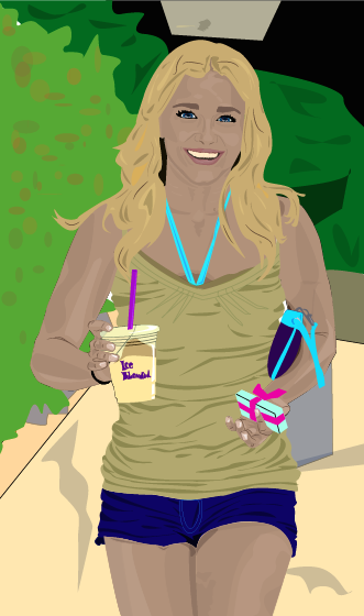
For my next project I created a vector illustration using only Adobe Illustrator. This began as a more collaborative project, as we folded a sheet of paper in three then blindly and randomly drew the three sections in segments without knowing what the rest of the body looked like. I chose the following image to recreate in Illustrator:
 I added color and used artistic license to make it more personal and what I believe to be aesthetically pleasing. I then came up with a concept for the background design. Due the the Florida State Fair being in town, I decided to use this as inspiration. I wanted to create a unusual, foreign feel to this image causing it to feel a little barren. I used a bright color scheme to contrast with the deserty ground. I believe this fits well with the design of the monster.


Monday, 9 February 2015
Final Logo Design
The logo I decided upon was the first design out of the hand-drawn listings shown in a previous post. In a survey, this proved to be the most popular design and represents the exotic, hawai'iany vibe I was shooting for. I began by drawing the outline with the pen tool.
 I then added color using the pen tool. I didn't want to the logo to appear flat, so I used a range of colors and opacities to build up layers, textures, and depths within the different hues. I wanted to keep the bright, airy feel so stayed with a more pastel color scheme. To allow the word "Smoothies" to be seen clearly, I kept the center of the leaf a light green, making it darker and layering it up closer to the edge.
With the flowers, I wanted bright colors that would stand out and be clearly seen and recognized from a distance. I, therefore, created texture and a range of merging colors by using short strokes, from light in the center, to dark on the outer edges of the petals. To cause them to appear more involved within the logo and not just backing decoration, I placed the "A" and "L" infront of the hibiscus flower with the center parts of the flower overlapping the "A", so the word was still clear, but the second "O" I placed behind the petal. I feel this causes the appearance of all aspects of the logo being intertwined and appearing as one.
The blue of the writing I had originally planned to be white. I was not, however, thinking of a background and, therefore, it would not show up or be clear, possibly looking unfinished. I chose a blue color to make the word "Aloha" stand out. I didn't want this word to appear segregated to the rest of the design, so I tried to merge from dark blue to light blue throughout the word, then into green to the leaf.
The black outline kept the shapes looking separate and clear. This outline was not needed on the bottom of the leaf as there are no other shapes or colors in it's proximity. I, therefore, removed the black outline to create a less harsh look, whilst- I believe- still keeping the finished appearance of the overall logo. The typography within both "Aloha" and "Smoothies" was custom made. The "Aloha" I drew with the pen tool, masking and adjusting a hand drawn type, creating all the letters to be mechanical shapes, except for the last "A", which I tried to create using more fluid lines to appear organic and merge into the leaf more easily. This is apposed to the "Smoothies" for which I used a pre-made font, then created an outline and adjusted the anchor points, angles and curves.
I then added color using the pen tool. I didn't want to the logo to appear flat, so I used a range of colors and opacities to build up layers, textures, and depths within the different hues. I wanted to keep the bright, airy feel so stayed with a more pastel color scheme. To allow the word "Smoothies" to be seen clearly, I kept the center of the leaf a light green, making it darker and layering it up closer to the edge.
With the flowers, I wanted bright colors that would stand out and be clearly seen and recognized from a distance. I, therefore, created texture and a range of merging colors by using short strokes, from light in the center, to dark on the outer edges of the petals. To cause them to appear more involved within the logo and not just backing decoration, I placed the "A" and "L" infront of the hibiscus flower with the center parts of the flower overlapping the "A", so the word was still clear, but the second "O" I placed behind the petal. I feel this causes the appearance of all aspects of the logo being intertwined and appearing as one.
The blue of the writing I had originally planned to be white. I was not, however, thinking of a background and, therefore, it would not show up or be clear, possibly looking unfinished. I chose a blue color to make the word "Aloha" stand out. I didn't want this word to appear segregated to the rest of the design, so I tried to merge from dark blue to light blue throughout the word, then into green to the leaf.
The black outline kept the shapes looking separate and clear. This outline was not needed on the bottom of the leaf as there are no other shapes or colors in it's proximity. I, therefore, removed the black outline to create a less harsh look, whilst- I believe- still keeping the finished appearance of the overall logo. The typography within both "Aloha" and "Smoothies" was custom made. The "Aloha" I drew with the pen tool, masking and adjusting a hand drawn type, creating all the letters to be mechanical shapes, except for the last "A", which I tried to create using more fluid lines to appear organic and merge into the leaf more easily. This is apposed to the "Smoothies" for which I used a pre-made font, then created an outline and adjusted the anchor points, angles and curves.


Thursday, 5 February 2015
Caligramme
Aside from the logo design project currently dominating my blog, I also looked into caligrammes.
Using only Adobe Illustrator, I completed a caligramme of the globe. Travel is something I am very passionate about and plan on continuing to do it throughout my life.
To begin this caligramme, I drew out a circular shape with the pen tool, then put text following the shape, leaving the fill blank and the outline/stroke black. On the outline of the planet, I chose to write a poem that I find to be intriguing and just like in general, relating to the topic. It reads: "San Fransisco has a park. Albuquerque is beautiful from a distance; it is purple at five in the evening. New York is Egyptian, especially from the little rise on the hill." I then added text (listed countries/locations eg.."Bali~ Cornwall~ Japan~" etc... vertically inside the planet to create the outline of land. Inside the countries/continents, I fitted a custom type, filling the area. I used a variety of greens for this typography to create the illusion of land. Since I was creating a whole planet with words, I decided to write "Words Shape The World" and "Travel". I feel this is kind of a play on words and might cause people to think or consider the different meanings of that. To create the illusion or imagery of water in the ocean, I drew wave shaped lines of different lengths, then, using different typography, sizes, and color for each line, I wrote words that connote the ocean such as "Wave," "Surf," "Depth," etc.... I left the continents that appear white blank (on the Pole), as I figured any writing would taint the simpleness of it, possibly causing it to appear cluttered.
 I have also used Adobe Photoshop to create calligram of a different style. Although not assigned in this class currently, I thought I'd include it anyway as did many projects like this last year whilst earning my Art and Design Diploma.

To begin this caligramme, I drew out a circular shape with the pen tool, then put text following the shape, leaving the fill blank and the outline/stroke black. On the outline of the planet, I chose to write a poem that I find to be intriguing and just like in general, relating to the topic. It reads: "San Fransisco has a park. Albuquerque is beautiful from a distance; it is purple at five in the evening. New York is Egyptian, especially from the little rise on the hill." I then added text (listed countries/locations eg.."Bali~ Cornwall~ Japan~" etc... vertically inside the planet to create the outline of land. Inside the countries/continents, I fitted a custom type, filling the area. I used a variety of greens for this typography to create the illusion of land. Since I was creating a whole planet with words, I decided to write "Words Shape The World" and "Travel". I feel this is kind of a play on words and might cause people to think or consider the different meanings of that. To create the illusion or imagery of water in the ocean, I drew wave shaped lines of different lengths, then, using different typography, sizes, and color for each line, I wrote words that connote the ocean such as "Wave," "Surf," "Depth," etc.... I left the continents that appear white blank (on the Pole), as I figured any writing would taint the simpleness of it, possibly causing it to appear cluttered.


Wednesday, 4 February 2015
Initial Logo Ideas
After spending some time deliberating between the my two favorite company ideas- the skate shop and the smoothie shop- I decided to further develop the idea of the smoothie shop. I feel this company idea has unique and individual aspect that will make it fun to experiment and play with further.
The next step was to come up with potential logo ideas for this company. The following are seven of my initial ideas, allowing me to pick a route I want to go down and further develop, fine tuning the design.
I have yet to consider or add color or fine tune any of the designs- just getting my ideas down onto paper.
1) On this page, I also messed around with company names. I wanted something unique and Hawaiian related, therefore, listed a variety of Hawaiian words that were a possibility. None of them were easy to pronounce or as recognizable as the simple "Aloha", so that is the name I decided upon.
The first logo idea of mine was influenced by the tropical, Hawaiian, exotic theme of the smoothie bar. Inspired by a location I love, I chose Hawaii's state flower: the Hibiscus flower. I used this to decorate the custom typography. Because this adds a lot of detail around and behind the name of the company, I attempted to make the font clear, large, and fairly simple so it is not suffocated and overtaken by the decoration. The "Aloha" is what I wanted to stand out the most in this design as it is what makes the companies name original, hence the word "smoothies" being smaller, thiner, and slightly less visible. Even though it the "smoothies" is a little less visible than "Aloha", I feel it still works and stands out, as the shading in the leave adds emphasis, balancing out the detail of the flowers and drawing the eye in.
 2) The second design lead me to play with two variations. I wanted to include the actual image of a smoothie, overflowing with fruit to convey the connotations of fresh and juicy smoothies. This furthers what the company would be selling, which I believe is an aspect that helps make a logo strong. I believe it would also allow me to develop a strong, bright color scheme. Out of the two, I prefer the top one. They are both incredibly rough sketches, but I feel it is clearer than the bottom one. The reason behind the design for the second one, however, was I like the idea of intertwining pictures with typography. This is a little difficult though however, as sometimes it can make to typography unclear.
 3) The third logo I have chosen connotes more so the vibes of the lifestyle many of the customers would foster. Once this company gathers recognition and popularity, I would like to expand it to become a chain, but without compromising quality. I would locate these smoothie bars along the beaches of Hawaii and California, appealing to the surf crowd and beach-goers. Due to this reason, I have designed this logo to draw in customers and appear relatable to the target audience. I used a slightly pictogram style of drawing, using three C-shaped curves to create a wave image. With the back end overlapping this wave, I then drew a surfboard, acting as an underline for the company's name. I believe this is an important aspect as it pulls the writing in, creating a more compact logo. The typography within this design is much like my first logo. The "Aloha" is large and bold to appear clear. The "smoothies" is thinner and more italicized, appearing sleek and full of speed.
 4) My fourth logo design has connotations of the exotic theme I want my smoothie bar to convey. I chose to use a humming bird with a large drop from it's beak, in which the company name will wrap around. I liked the idea of using this bird, as it is beautiful and fast. It also is dependent on nectar, creating thoughts of juicy, fresh and nature. To create it to be different, recognizable, and easile replicable, I used fluid, flowing shapes to create the shape of the bird. I believe this style of design also creates it to be unique and has great potential for a bright color scheme.
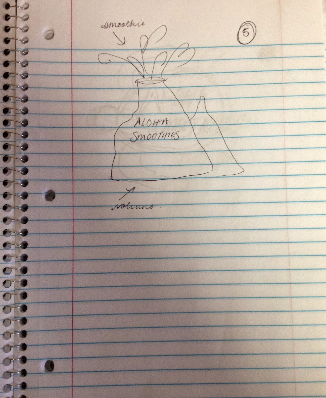
 5) This logo idea was also inspired by aspects of the state of Hawaii. I used the idea of volcanoes. Despite the terrible sketch of the initial design, the idea behind this logo is the volcano- symbolizing Hawaii- is spewing smoothie. It would be active, forceful logo and demand attention due to the nature of volcanoes. I think the idea is good in theory, but I don't think it would make for a very interesting logo so will probably not go down this route.
 6) I like this design mostly due to it's simplicity. It connotes the beachy, surfing vibes through the use of a rugged tortoise, however, it is not heavily related to smoothies so I'm not sure if it would be the most effective logo. I think the typography matches it well, despite the rough sketch, I personally feel it follows the rustic, laid back style. This is exemplified by running it off the background design so that it is not contained, also causing it to pull focus. I would probably use a range of blues for the design, and white for the typography.
 7) The last logo design I created is the 'hang loose' design. This follows the beach, surf-skate, laid back culture prominent in the locations I wish to open my smoothie bars. This is another occasion in which I think incorporating the typography in the design, morphing it together in a way, allows it to be unique and eye-catching.


Friday, 30 January 2015
Logo Critiques
Domino's Pizza:
Domino's Pizza is the first logo I have chosen to critique. Overall I believe this a strong logo. The fact the name is written and incorporated into the design makes it clear to an audience what company and products it is representing. The idea of incorporating the actual domino image into the logo exemplifies it's name and causes it to be memorable. Originally, the idea for the logo was to use the dots on the dominos to represent each of the individual stores that was open, however, as the company expanded rapidly, this became impossible. The color scheme of red and blue also causes the domino and the white lettering to stand out. Domino's Pizza has recently started using an updated version of their logo in which they drop the section that has the typography on it and only use the domino pictogram style image. The fact they can do this and it still be easily recognizable represents the company's success. Overall, I believe this is a strong logo design
 Starbucks:
I believe there are both good and bad aspects of the Starbucks Coffee logo. Similar to Domino's Pizza, the fact the name of the corporation is included within the logo in an aesthetically pleasing way leads it to be successful, as this clearly presents what product they are selling. The color scheme is also good in my opinion. The green, white, and black cause it to stand out and be memorable. I do, however, believe there are less effective aspects to this logo. I have heard countless times people questioning what relevance the mermaid figure in the middle represents or has to do with coffee. This is not clear without researching the history of the logo, although, after looking this up, it makes sense. The significance of the mermaid represents the pacific North West Heritage, as the company began in Seattle. The crown the mermaid is shown to be wearing also represents the product, as it symbolizes the Statue of Liberty, exemplifying how the coffee is both American branded, and founded.
Starbucks:
I believe there are both good and bad aspects of the Starbucks Coffee logo. Similar to Domino's Pizza, the fact the name of the corporation is included within the logo in an aesthetically pleasing way leads it to be successful, as this clearly presents what product they are selling. The color scheme is also good in my opinion. The green, white, and black cause it to stand out and be memorable. I do, however, believe there are less effective aspects to this logo. I have heard countless times people questioning what relevance the mermaid figure in the middle represents or has to do with coffee. This is not clear without researching the history of the logo, although, after looking this up, it makes sense. The significance of the mermaid represents the pacific North West Heritage, as the company began in Seattle. The crown the mermaid is shown to be wearing also represents the product, as it symbolizes the Statue of Liberty, exemplifying how the coffee is both American branded, and founded.
 Vans:
Vans is a California based shoe manufacturer. It has a variety of logos that are associated with it but the word "Vans" is always written in the original design. Due to the popularity of the company, the word "Vans" causes anyone to know what it is representing. I personally think their logo captures and highlights the laid-back, surf and skate culture around the coastal area, therefore, proving it to be successful in that aspect. The skateboard incorporated into the logo with the typography "Vans "Off The Wall"" also keeps it aesthetically appealing and relates to the items they are producing and selling. The color scheme of red and white is bright and vibrant, causing the logo to stand out and be memorable.
This logo was developed and updated many times since the founding of the company in March, 1966, and by the 1970s was appealing to the skate crowd through the rugged looking design of the shoe. This shows how not only the logo, but also the angle the company is selling and advertising towards gets changed and influenced due to public demand and interest.
Vans:
Vans is a California based shoe manufacturer. It has a variety of logos that are associated with it but the word "Vans" is always written in the original design. Due to the popularity of the company, the word "Vans" causes anyone to know what it is representing. I personally think their logo captures and highlights the laid-back, surf and skate culture around the coastal area, therefore, proving it to be successful in that aspect. The skateboard incorporated into the logo with the typography "Vans "Off The Wall"" also keeps it aesthetically appealing and relates to the items they are producing and selling. The color scheme of red and white is bright and vibrant, causing the logo to stand out and be memorable.
This logo was developed and updated many times since the founding of the company in March, 1966, and by the 1970s was appealing to the skate crowd through the rugged looking design of the shoe. This shows how not only the logo, but also the angle the company is selling and advertising towards gets changed and influenced due to public demand and interest.

 Hollister:
Hollister is a famous clothing company, in America, being the second best selling for US teenagers. Within the clothing industry, the logo is popular and instantly recognizable. I believe this is partially due to the simplicity of the logo- a flying gull, representing costal California, where the company is based. Within the logo, there is also simple, customized typography, saying "Hollister California." Like many of the others, I believe this helps the logo to be successful as it makes it evident which company it is representing. The color scheme is maroon and silver, originally designed to represent bravery, sophistication, power and happiness.
Hollister:
Hollister is a famous clothing company, in America, being the second best selling for US teenagers. Within the clothing industry, the logo is popular and instantly recognizable. I believe this is partially due to the simplicity of the logo- a flying gull, representing costal California, where the company is based. Within the logo, there is also simple, customized typography, saying "Hollister California." Like many of the others, I believe this helps the logo to be successful as it makes it evident which company it is representing. The color scheme is maroon and silver, originally designed to represent bravery, sophistication, power and happiness.
 Target:
The final logo I have chosen to critique is Target. I believe this is a very strong logo from all aspects. Firstly, the image is literally a target, representing the name of the store directly. The color scheme- much like the Vans "Off The Wall" logo- is red, sometimes backed on white, standing out and being memorable. Its also incredibly simple, causing it to be instantly recognizable and universal if it was to be seen on the side of a store or a billboard. On many occasions, the name of the company (Target) is also written underneath the image, causing it to be even more obvious.
Target:
The final logo I have chosen to critique is Target. I believe this is a very strong logo from all aspects. Firstly, the image is literally a target, representing the name of the store directly. The color scheme- much like the Vans "Off The Wall" logo- is red, sometimes backed on white, standing out and being memorable. Its also incredibly simple, causing it to be instantly recognizable and universal if it was to be seen on the side of a store or a billboard. On many occasions, the name of the company (Target) is also written underneath the image, causing it to be even more obvious.


Tuesday, 27 January 2015
Five Company Ideas
Yoga:
In particular 'Hot Yoga' or 'Bikram Yoga,' therefore, "Heat Retreat" could be a possible name.
This would focus on the health and relaxation side of yoga; connotations of detox. Calm, cool colors would be used for the logo to exemplify this theme.
This company would be marketed towards a generaly large audience, however, due to the nature of yoga, the focus would naturally consist more of young females adults/ teenagers interested in having a healthy body and mind. Sleek and modern design techniques would be employed.
 Smoothie:
The main idea with this one is to create fresh, healthy, tropical, fruity smoothies, in a range of flavors. Similar to the yoga idea, this would have a target audience of many, but would probably draw those interested in health.
With regards to imaging and color scheme, lots of bright, warm colors would make it effective; yellows, oranges, reds. This paired with images of juicy fruits and sunny, sandy beaches or beach themed items would also cause it to be appealing and fit the stereotype of smoothies in the summer.
A possible name for this company could be "Summertime Smoothies" or something to this effect. I could possibly follow the tropic vibe and go for a theme, such as Hawaiian and name it "Aloha" to appear inviting and exotic.
Smoothie:
The main idea with this one is to create fresh, healthy, tropical, fruity smoothies, in a range of flavors. Similar to the yoga idea, this would have a target audience of many, but would probably draw those interested in health.
With regards to imaging and color scheme, lots of bright, warm colors would make it effective; yellows, oranges, reds. This paired with images of juicy fruits and sunny, sandy beaches or beach themed items would also cause it to be appealing and fit the stereotype of smoothies in the summer.
A possible name for this company could be "Summertime Smoothies" or something to this effect. I could possibly follow the tropic vibe and go for a theme, such as Hawaiian and name it "Aloha" to appear inviting and exotic.
 Skate Shop:
I believe this idea has a lot of potential with regards to the logo design. There are a lot of images that could be incorporated; any thing to do with the skater, laid back, beach lifestyle that is typical among board riding. It could sell a range of items within this theme/ lifestyle; not just skateboards, but longboards, baseball caps, backpacks, shoes, laptop/ surfboard stickers...etc...
There is a large target audience for this company, and therefore, there are a lot of options and possibilities available that I could incorporate into the design and branding of the company and it's products.
I could go with a more cliched name for this, such as using sibilance to make it memorable, e.g. "Sarah's Skate Shop"
Skate Shop:
I believe this idea has a lot of potential with regards to the logo design. There are a lot of images that could be incorporated; any thing to do with the skater, laid back, beach lifestyle that is typical among board riding. It could sell a range of items within this theme/ lifestyle; not just skateboards, but longboards, baseball caps, backpacks, shoes, laptop/ surfboard stickers...etc...
There is a large target audience for this company, and therefore, there are a lot of options and possibilities available that I could incorporate into the design and branding of the company and it's products.
I could go with a more cliched name for this, such as using sibilance to make it memorable, e.g. "Sarah's Skate Shop"
 Hairdressers:
Everybody needs hairdressers. This is a competitive field though, so I would, therefore, like to make my brand/ company stand out if I were to follow through with using this as an idea.
I would want to represent this as sleek and modern. It would need to look trustworthy, a place with talent and experience, as I know better than any; one has to be able to trust someone to let them cut or dye ones hair. Stylish would therefore be the main goal.
As there are so many hairdressers around and available to a mass audience, I would need a catchy, memorable name. Something that remains professional, yet fun.
Similar to some of my suggested ideas before this one, for this company, there would be a lot of opportunity to incorporate images used in this trade into the logo. This would largely help in branding.
Hairdressers:
Everybody needs hairdressers. This is a competitive field though, so I would, therefore, like to make my brand/ company stand out if I were to follow through with using this as an idea.
I would want to represent this as sleek and modern. It would need to look trustworthy, a place with talent and experience, as I know better than any; one has to be able to trust someone to let them cut or dye ones hair. Stylish would therefore be the main goal.
As there are so many hairdressers around and available to a mass audience, I would need a catchy, memorable name. Something that remains professional, yet fun.
Similar to some of my suggested ideas before this one, for this company, there would be a lot of opportunity to incorporate images used in this trade into the logo. This would largely help in branding.
 Brownie Shop:
I feel there would be lots to go with this one. I could focus on the variety of flavors that would be available to customers, incorporating different tastes, such as nuts, fruits, mints, etc... This would therefore suit everybody's individual tastes! I would decorate and make them with attractive designs so they would stand out from the crowd. A little like cake designers, except with delicious brownies.
Unlike the others, this is a much more concentrated audience; those who enjoy brownies (Who doesn't!)
Due to the design and style aspect of this company, I feel a name such as "Beautiful Brownies" would be self-explanitory and appropriate, however, if I choose to further develop this idea, would seriously consider and brainstorm more titles, in order to make it sound more witty and memorable.
Brownie Shop:
I feel there would be lots to go with this one. I could focus on the variety of flavors that would be available to customers, incorporating different tastes, such as nuts, fruits, mints, etc... This would therefore suit everybody's individual tastes! I would decorate and make them with attractive designs so they would stand out from the crowd. A little like cake designers, except with delicious brownies.
Unlike the others, this is a much more concentrated audience; those who enjoy brownies (Who doesn't!)
Due to the design and style aspect of this company, I feel a name such as "Beautiful Brownies" would be self-explanitory and appropriate, however, if I choose to further develop this idea, would seriously consider and brainstorm more titles, in order to make it sound more witty and memorable.


Sunday, 25 January 2015
Introduction
My name is Sarah and this is my blog. I grew up in England, not all that far away from London, and decided- for a change- to come to the University of Tampa to study and further my Education. I immediately got involved in the school, trying out for the cheerleading team in the summer and joining a sorority when I finally got here.
 After deliberating for a long while over what to major in, I came into the school with the intent to study Graphic Design, however, as the classes progressed and the semester neared the end, I changed to major in Advertising and Public Relations as I felt this broadened my options in terms of deciding upon a career- because I still have NO idea what I want to do with my life other than travel.
From taking this course in Beginning Digital Arts I hope to expand my knowledge about computer aided design. I would like to learn more about how to use and operate software such as Illustrator, Photoshop, etc.. I learned the basics of how to use these programs last year at my school in England and was pretty good at messing around with it and figuring something out if I wasn't sure how to use it, but I would like to actually gain a better understanding of what I'm doing. I feel this will be helpful in figuring out if this area of work is a path I want to go down in terms of a career or job after college.
I expect to learn a lot from this class and think it will be helpful to me.
After deliberating for a long while over what to major in, I came into the school with the intent to study Graphic Design, however, as the classes progressed and the semester neared the end, I changed to major in Advertising and Public Relations as I felt this broadened my options in terms of deciding upon a career- because I still have NO idea what I want to do with my life other than travel.
From taking this course in Beginning Digital Arts I hope to expand my knowledge about computer aided design. I would like to learn more about how to use and operate software such as Illustrator, Photoshop, etc.. I learned the basics of how to use these programs last year at my school in England and was pretty good at messing around with it and figuring something out if I wasn't sure how to use it, but I would like to actually gain a better understanding of what I'm doing. I feel this will be helpful in figuring out if this area of work is a path I want to go down in terms of a career or job after college.
I expect to learn a lot from this class and think it will be helpful to me.


Subscribe to:
Posts (Atom)